
Genre: I have chosen to make a magazine about men's fashion and lifestyle.
Target Audience: My TA for this magazine are males, who have an age range of 20-35 and fit into the A-B social class. They have a explorers and reformers psycho-graphic profile. They would look to expand their wardrobe, and would be interested in quality brands.
PLAN
MASTHEAD
NAMEs.
- LUI
- 'Him’ in French.
- French has connotations of sophistication.
- France is one of the the leading countries for fashion.
- Target audience Appeal
- Short and snappy- easy to remember- easy to recognize.
- Him effectively expresses masculinity- represents the TA - its their magazine/a magazine made for them.
- Target audience Appeal
- ICON
- relating to or of the nature of an icon.
- depicting a victorious athlete in a conventional style.
- Connotes uniqueness and individualism.
- Target Audience Appeal
- Effectively expresses the values of the magazine - fashion that stands out.
- TA strive to be fashion icons - aspiration is reflected through magazine.
- Target Audience Appeal
- DENIM
- Jeans is considered casual wear and worn by men and women outside workplaces.
- Jean = clothes = fashion.
- Target Audience Appeal
- Common word -easy to understand and recognize.
- Links to the genre of the magazine (FASHION).
- Target Audience Appeal
- MW
- 'MENS WEEKLY'
- Short and easy to fit into a corner - out of the way- focus is on the model and the clothes.
- Simple - easy to remember and to recognise
- Target audience Appeal
- Conveys the genre of the magazine tok the audience (MENS FASHION)
- Target audience Appeal
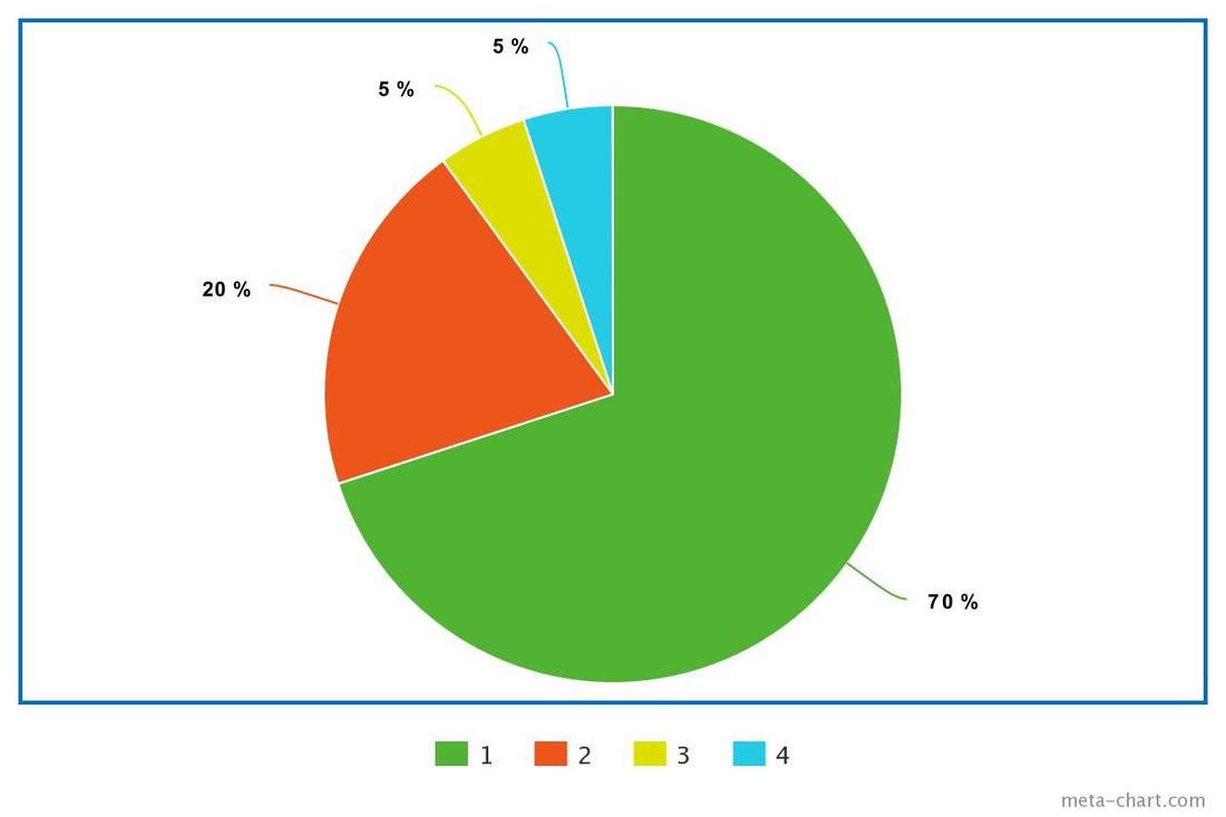
I conducted a survey on 50 people who fit my TA, and asked for their opinion on which masthead they preferred. Here are the results.

|
From this pie chart, we can see that 'ICON' was the most popular, with 40% of the votes.
I think it was most popular because of the associations that come with word. Icon is a noble label, given to those who exceed expectation in their specific field. As I have stated above, the semiotics of the words, such as idol or high status, are thing that the TA will aspire to be. 'DENIM', surprisingly, was the least preferred options with only 10% of the votes. Before the survey, I thought that DENIM would attract a lot of the participant, as it is such a recognizable word, and relates heavily to the genre. When i asked the participant why they did not like 'DENIM' they stated that they thought it was either too simple or too casual, and need to be more striking, which i agree with. |
FONTS.

|

|


|
On my research page, I analysed 2 male fashion front cover. I noticed that GQ used a bold and large text, and used cap locks. This is a very common convention in men's fashion magazine. This attracts a male audience, as it is universally known as a masculine font. The bold text connotes themes of strength and power, which are things that men's magazine usually promote to their audience.
Here are the fonts that chosen for my mast head:

|

|

|

|
I conducted another survey on the same 50 people for their opinion on which masthead font they preferred. Here are the result:
|
From this data, we can conclude that font style 1 was the most popular.
I think the audience preferred this font the most as it is bold and simple, similar to most male fashion magazines. |
Colour scheme
|

|

|
According to my research, my colour scheme that I choose for my magazine is very unconventional, as men fashion magazine lack colourful and bright colour, and usually are made up of muted and earthy tones, such as beige's', blues or whites. I decided to go against this stereotypical codes to create a unique selling point for my magazine. This may be refreshing to the TA, compelling them to buy the issue. There has also been plenty of research that show us that bright colours increase sales. However, there are many negatives and risks of going against codes and conventional of a genre. One of the main problems with using a contrasting colour scheme to the typical one, is that it may be less obvious to readers the genre of the magazine, which may repeal the TA.
I decided to do research to see how I could over come this problem, and use other factors to ensure the audience on the genre of the magazine. If we look at the GQ magazine front cover (Sam Smith) that I analyzed on my research page, we can see that colour scheme consists of bright and even florescent colours. However their iconic masthead reassures audience on their genre. I will ensure to make my masthead easy to recognize, simple (helping it stick in audiences head) and have relevance to masculinity. I will also use a male for my main model, which is one of the main conventions of a men fashion magazine.
I decided to do research to see how I could over come this problem, and use other factors to ensure the audience on the genre of the magazine. If we look at the GQ magazine front cover (Sam Smith) that I analyzed on my research page, we can see that colour scheme consists of bright and even florescent colours. However their iconic masthead reassures audience on their genre. I will ensure to make my masthead easy to recognize, simple (helping it stick in audiences head) and have relevance to masculinity. I will also use a male for my main model, which is one of the main conventions of a men fashion magazine.
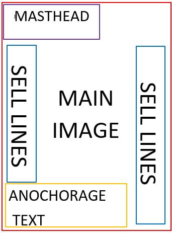
SELL LINES & ANCHORAGE TEXT
Anchorage Text
Sell lines
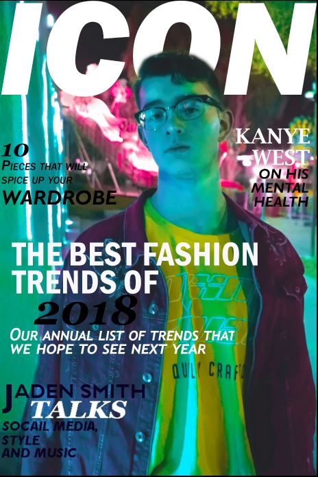
- 'THE BEST FASHION TRENDS OF 2018. Our annual list of the trends that we hope to see next year'
- THE BEST: attracts reformer audience, how are interested in good quality brands and items.
- FASHION TRENDS: conveys genre of the magazine. Attracts psycographic who are interested in fashion (AKA everyone in my TA)
- OF 2018: temporal.
- Our annual list of trends: Audience will be anticipating the annual issue as they will be found of it from previous issues.
Sell lines
- Jaden Smith talks style, social media, and music. - well knows artist and fashion icon.- star appeal.
- 10 Pieces that will spice up your wardrobe. - attract explorer audience who will be looking for daring and out here pieces.
- Kanye West on his mental health. - extremely famous male artist- star appeal.
- Everything you need to know about Paris Fashion Week. - well known annual fashion event- attracts a second audience who follow events like this.
STEP BY STEP PROCESS
|
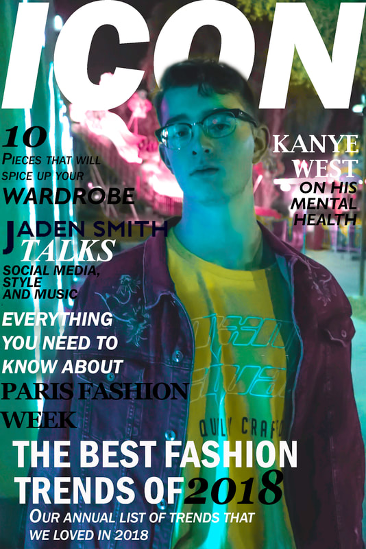
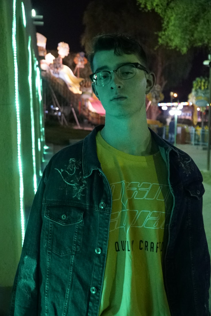
Out of all my photos, I decided to use this one for the front cover.
The photo is made up of a mid shot of my friend Nick. The mid shot follows the conventions of a male fashion magazine, conveying the genre of the magazine to the audience. The space above his head leaves space for the masthead, and space around him leaves space for the sell lines and anchorage text. The colourful lighting gives me a lot to work with to try to make it fit my desired colour scheme. This colourful lighting is unconventional, making it stand out amongst other magazines. Below, I have described the process of how I transformed this photo to be front cover worthy ::)) ps: excuse the the bad quality pics, i had to print screen the steps as I went along, and for some reason they came out a bit grainier than the actual thing. |

|
STEP 1)
I imported the picture into light room, and began playing around with the hues until I was happy with the result. I changes the green light that falls onto his face into a more blue/aqua tone. I also made the the yellow in his shirt brighter, since clothing is the main mise en scene of a male fashion magazine. I increased the purple hue, adding a splash of purple to his jacket and also changed the orange ride in the back to a pink colour, to fit the colour scheme. |

|
STEP 2)
Unfortunately, my photos turned out grainier then I had hoped so i turned up luminance to create a smoother look. 
|

|
STEP 3)
I went into camera calibrations and played around with the red, blue and purple primary saturation and hues until i got closer to the colour scheme that i desired. This also made all the colour pop, signifying the location of this shot - a carnival. The shirt is more of a brighter and neon yellow, compared to the faded yellow that it started with. This grabs the audience attention, specifically the explorer demographic who are attracting to daring or out there items. |


|
STEP 4)
I moved the image out from light room, and into photo shop to add some finishing touches. I started by using the smudge tool to remove the harsh line that had formed when I was playing with the hues, and smoothed out certain parts where you could see pixels. I then went through with a spot healing tool lightly to remove any blemishes or spots.
|


|


|
STEP 5)
For some reason, his eyes look extremely uneven in the photo. His right eye looked slightly up turned compared to his left eye and it was also closed a little. To fix this, I selected the area where is eye was, and used the transform tool to get it to the correct angle so that the two eyes look even. I had to play around with the angle a few times in order to get to get this result. I used the history brush tool to fill in the gaps. When his eyes were even, i started working on opening them up. First, I used liquefy to increase the size of his eye, and also changed the shape of his eyes, creating a more almond shape. I then decreased the size of tool and changed his iris into a more natural looking circle. 
|

|

|
STEP 6)
I used the dodge tool to accentuate the highlights on his face. To add reflection to the eye, I first tried to use the paint brush tool in a light blue colour, however this looked unnatural, so I used the dodge tool for this as well. |

|
After a few finishing touches, such as adding shadows to his eyelid, accentuating his jawline ever so slightly and adding a bokeh reflection in his glasses, i was finished with editing the picture.
I am happy with the result and up pleased with the main colours in the image, to really push the playful and adventurous agenda. Now it was time to add the masthead, sell lines and anchorage text which would transform this portrait to a real magazine front cover. |

|

|
STEP 7)
I added in the masthead above his head, since my research shows that most, if not every, fashion magazine places their masthead in that position. I decided to move the text behind him, to not cover this face and take the attention off the models clothing. As well as this, it shows that magazines masthead does not need to be fully shown or displayed for it to be noticed, conveying the popularity of it. I did this my simply and carefully rubbing out the sections of the text that covers his face, to create the illusion of it being behind him. This technique is used in many male fashion magazines. |
|
|
STEP 8) I added the anchorage text, varying the size in text and font style. I did this to break up the text, separating key point of the text. For example I split the short description of the story from the title of the story, by decreasing the size, and using an italic version of the same font. This creates a link between the two, as the font is the same, but is also simple to differentiate because of change in style and size. I used the clone stamp tool to cover the the white light with the wall texture, as it drowned out the text, making it difficult to read. I used a bold font to help the anchorage text stand out. I used cap-locks for this same reason. Bold, cap locks text is commonly used on male fashion magazines front covers. Fonts used: Franklin Gothic Demi Cond. Georgia. |

|
STEP 9)
I added in my sell lines. As i added each in, I realised that I did not have enough space for all the sell lines that I had planned to add. This meant that I was unable to add the sell line 'Everything you need to know about Paris Fashion Week'. In certain areas where i had used white text, i had to manipulate the backgrounds to ensure that the white did not get lost in the bright background. I decided on a black and white colour scheme for the fonts, to not over whelm the audience with colour, as it tones the bright and chaotic main image. |
FIRST DRAFT:
SECOND DRAFT:

|
After speaking to my focus group and teacher, we decided that the position of the sell lines and anchorage text should be moved around.
This gave me space to add in my final sell line: 'EVERYTHING YOU NEED TO KNOW ABOUT PARIS FASHION WEEK'. I also increased the size of the '10' in the sell line. After completing all three of my pieces, my teacher gave a some feedback. He told me that the other two pieces were much more conventional, and that the front cover seemed out of place due it the overuse of colour. I agreed with this statement, and decreased the saturation of some of the colours, in order to get a more toned down version. Some of the text was also a bit grainy, so i rewrote it to make it sharper and clearer. |
