
INITIAL IDEA
|
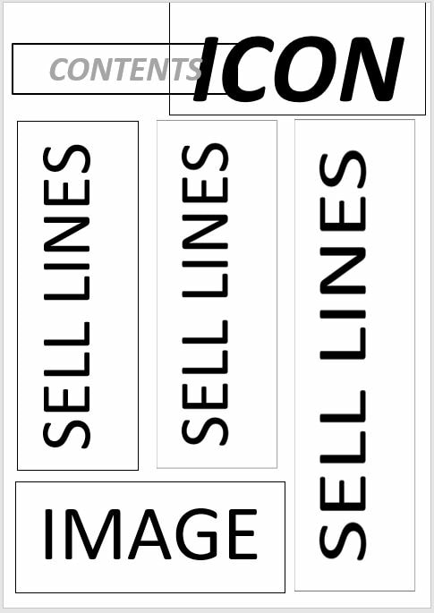
Here, I have outlined a simple layout for my contents page.
On my research page, I analysed two contents pages. Both had the title (CONTENTS) and the masthead sitting at the top of the page, side by side. The background of GQ's and Esquire contents pages were all white, and their main elements where the text (sell lines) and one main image, a maximum of two secondary images that correlate with a sell line. This is usually done to break up the text, giving readers eyes a rest form the chunks of text, as well providing readers with visual aid. I noticed that GQ splits up their sell lines by topic. These include: Fashion, Cars, Grooming, and other main topics associated with men's fashion and lifestyle. I will be using the subtopics, to help organize my page, as i believe it creates a more structural look to page, not only making it easier for the reader to find certain articles pages they're interested in, but also makes the large amount for sell lines less overwhelming to look at. The topic titles in a GQ contents page are highlighted by using rectangular rhombus shaped text boxes. This adds a splash of colour to an otherwise plan page. I will be using this technique to add colour to my page, to keep the vibrant colour scheme throughout, without losing it's masculine touch. |
Colour scheme
I decided to use the same colour scheme that I used in my front cover, but in a more subtle and downplayed way. The main colour i will use include:
- Blue - connotes trust, confidence, wisdom and is commonly considered a masculine colour.
- White - stands out and makes the magazine clear and clean
- Pink - subtle amount. A daring colour to use in a men's fashion magazine - challenges stereotypes.
- Teal - subtle amount. Connotes creativity and uniqueness.
SELL LINES
ON THE COVER:
FASHION:
POLITICS:
MUSIC:
LIFESTYLE
CARS
HYGIENE
SOCIAL MEDIA
- JADEN SMITH
- SPICE UP YOUR WARDROBE
- KANYE WEST
- PARIS FASHION WEEK
FASHION:
- STRIPES, STRIPES AND STRIPES.
- ACCESSORIES
- MAKE UP FOR MEN
POLITICS:
- ARTICLE 13
- TRUMP ORDERS TROOPS OUT OF SRYIA
MUSIC:
- BEYONCE'S NEW ALBUM?
- TYLER THE CREATOR IS BLOWING UP!
- BEST POP AND ROCK OF 2018
LIFESTYLE
- THE PERFECT BEDROOM
- KETO DIET
CARS
- RETRO CARS
- REVIEWING JEEP WRANGLER
- 2019 CARS!
- TESLA
HYGIENE
- HOME SPA DAY
- GROOMING GIFTS
- P&G's NEW RAZOR
- 13 BEST FACE WASH
SOCIAL MEDIA
- TRENDS TO WATCH IN 2019
- SOCIAL MEDIA STAR ARRESTED!
PHOTOGRAPHY

|
I decide on using this image for my contents page. I think this picture shows the the models outfit well, in conventional wide shot. He is making direct mode of address, vital for creating a connection between the model and the audience. The lighting is a combination of a warm yellow, and green hues, giving me plenty of opportunity to play around with the editing,as well as fitting the bright and unconventional theme of my 3 pieces.
|
To make this image more suitable for the contents page, I decided to flip the image. This creates a more put together look, since the reader will be reading the text from left to right, like how the readers will look at the model, from head to toe.
Since the background of the contents page is white, I decided to cut the model out of the rest of the picture, out of the box image with the selection tool
The models face is drowned out by the intense lighting, so I decided to edit the image in Lightroom, to not only correct his skin colour, but to also make the colours in his outfit pop.
step by step PROCESS

|
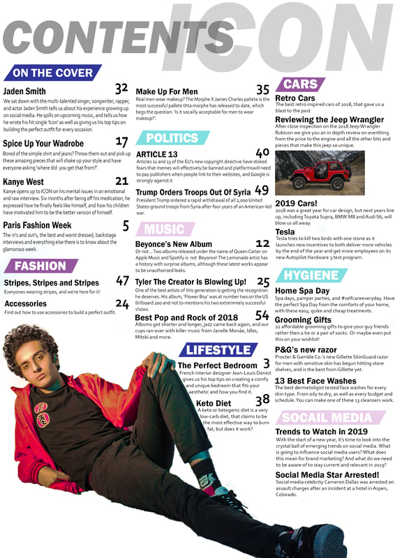
STEP 1)
I started by adding a the text. I used a bold and italic font for the 'CONTENTS' title, similar to the masthead font on the front cover, creating a smooth flow between the front cover and contents page. Cap locks is commonly used for titles in mes fashion magazine, since it has connotations of power, and helps distinguish between the sell lines and the title |

|
STEP 2)
I then added the masthead, 'ICON ' to the right of the contents title in a light grey to match the greyscale colour scheme of the sell lines on the front cover, once again to create a smooth flow from the cover to the contents page. I decreased the opacity of the word contents, so that it was more shear, and you can see outlines of the word ICON from behind it. This shows audiences that the this contents page is ICON's, creating a label that audiences will instantly recognize. |

|
STEP 3)
I used the line tool to add guidelines for when I add the section titles and sell lines, to ensure that the text format does not look messy and is pleasing to the audiences eyes. I used the selection tool to cut out my model from the rest of the photo and placed him at the bottom left of the page. By cutting him out of the original picture, it gives me more space on the page to add all my sell lines, as well as not taking away from the main focus of the image, the model and his clothing (mise en scene) 
|

|
STEP 4)
I then used the polygonal lasso tool to create this rectangle rhombus type shape, and filled them with the colour scheme of the front cover, once again to create a flow between the three pieces. I will be using these as a background for the section titles, to help them pop, and for audiences to easily differentiate between the story topics. 
|

|
STEP 5)
I then added the section titles into the rhombus, in a white bold text. The white makes it stand out amongst the bright background. Using a consistent font style and font colour makes the page aesthetically pleasing for the audience. |

|
STEP 6)
I then continued to add all the sell lines in a bold text, with a smaller size of the same font type for the description. I then used a bigger font size for the page number of the story, to help distinguish between the different forms of text. From my research, I found that this convention is used commonly on contents pages, as to not confuse the audience I used the guidelines to keep the text in line to ensure that the page does not look messy. I also added a picture of one of the cars mentioned in the sell line to break up the text, giving the readers eyes a break from the blocky text. This image is from https://www.businessinsider.com/2018-jeep-wrangler-details-2017-11 |
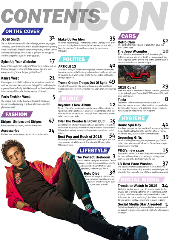
FIRST DRAFT - CONTENTS PAGE:
FINAL
|
This is the final edit to the contents page. My focus group pointed out some spelling errors that i had missed earlier, so i went through and fixed those.
I also realized that i had missed the page numbers for some of the sell lines, so added the number in the same text, size and position, to create a continuace theme. |
